
Ahsan Properties ─ Brand identity
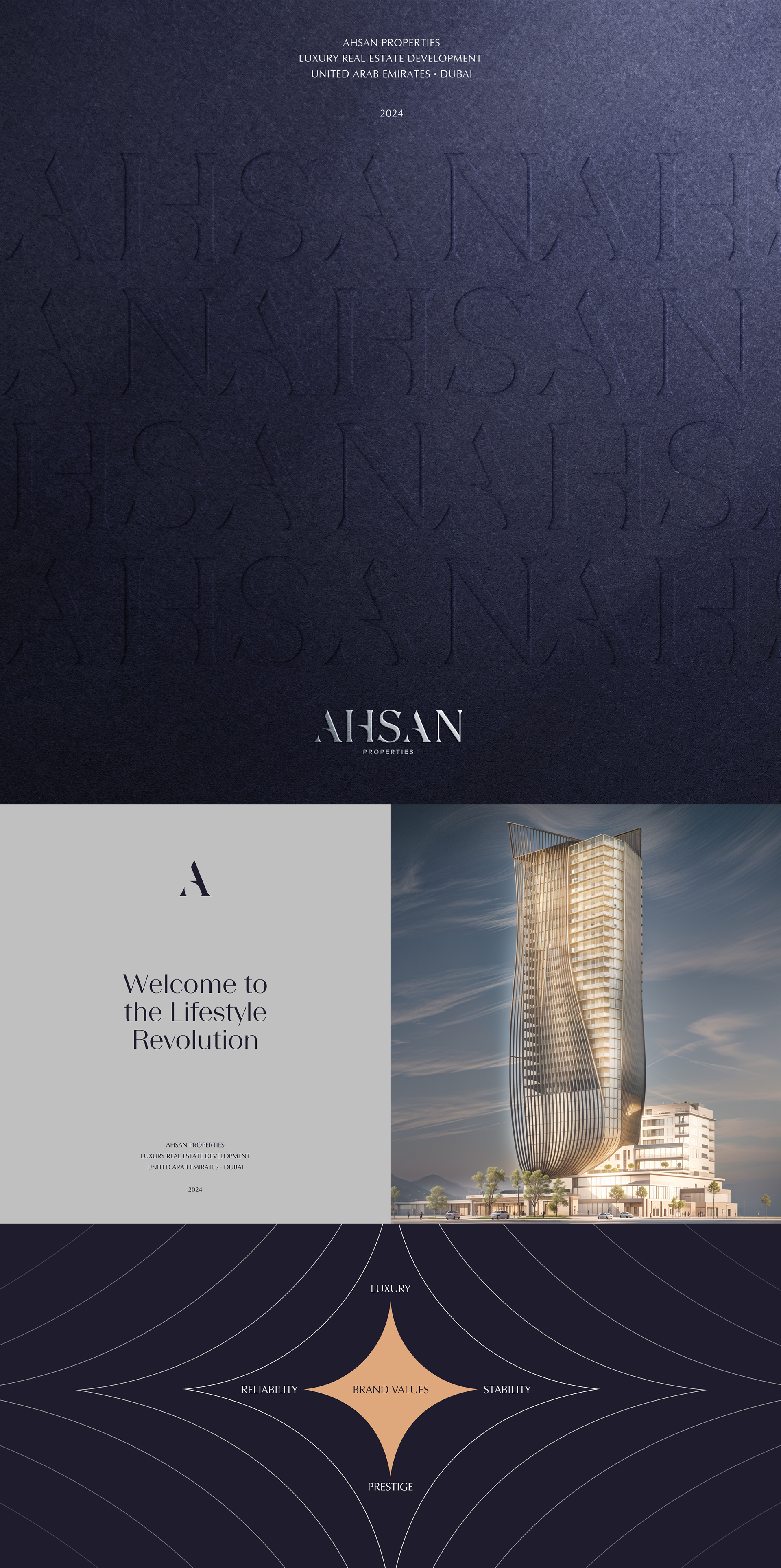
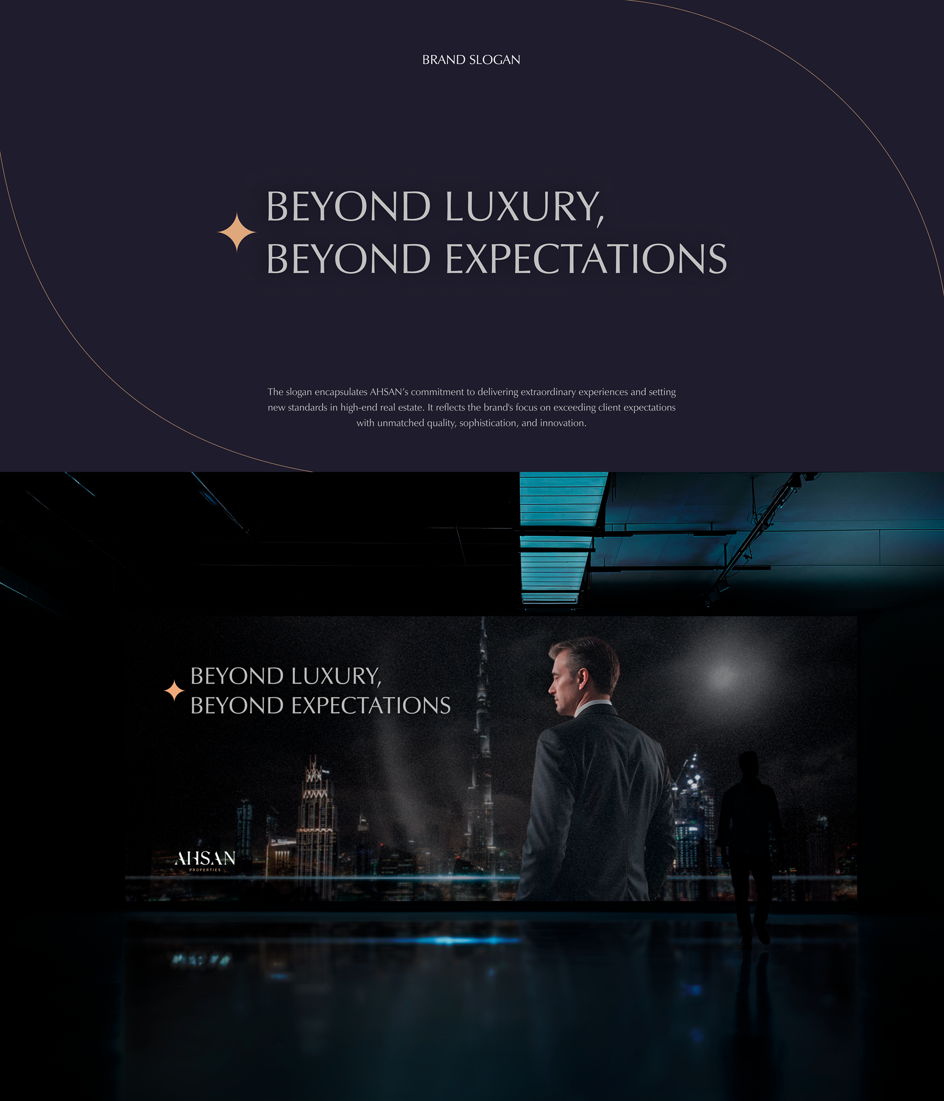
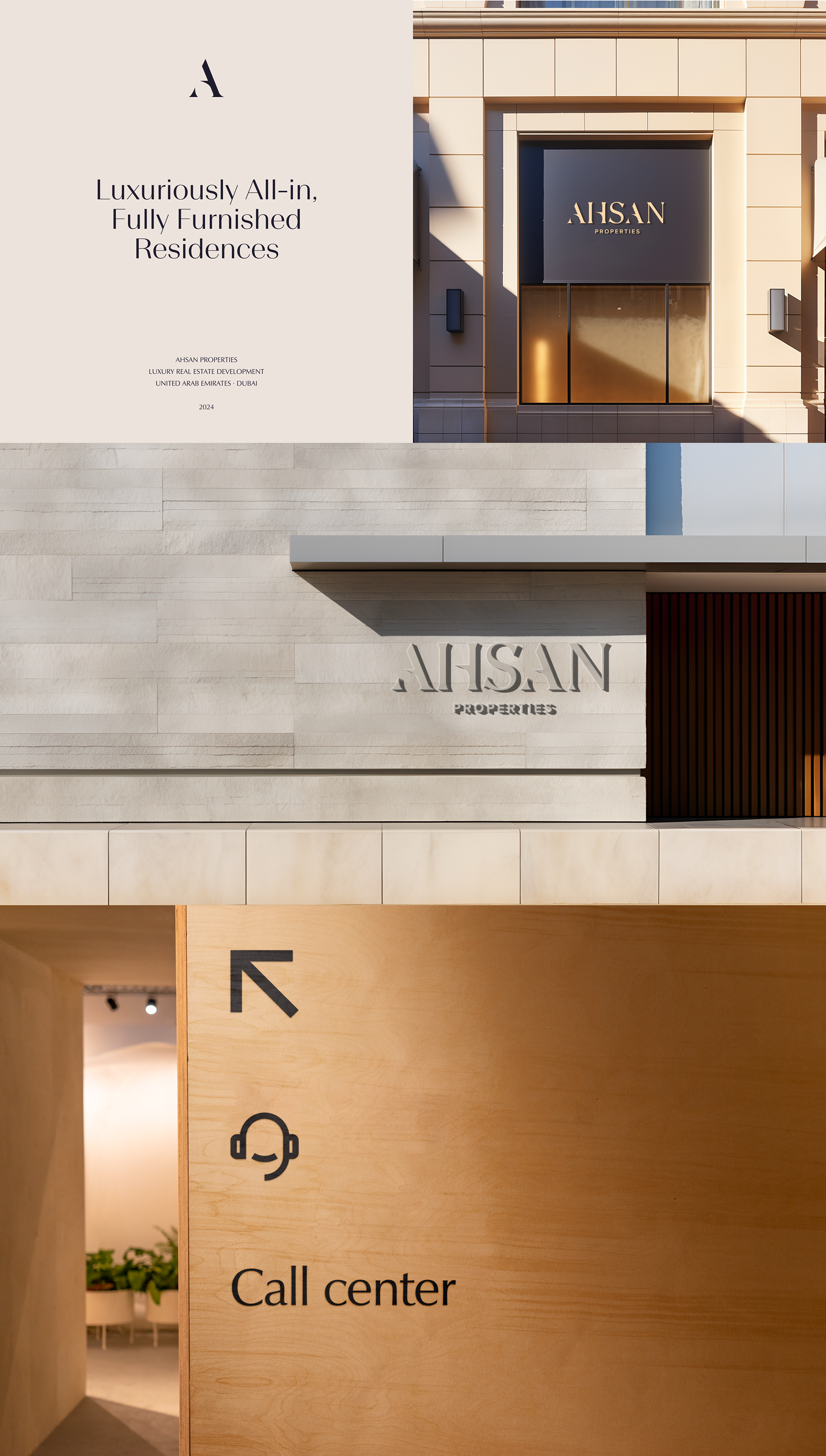
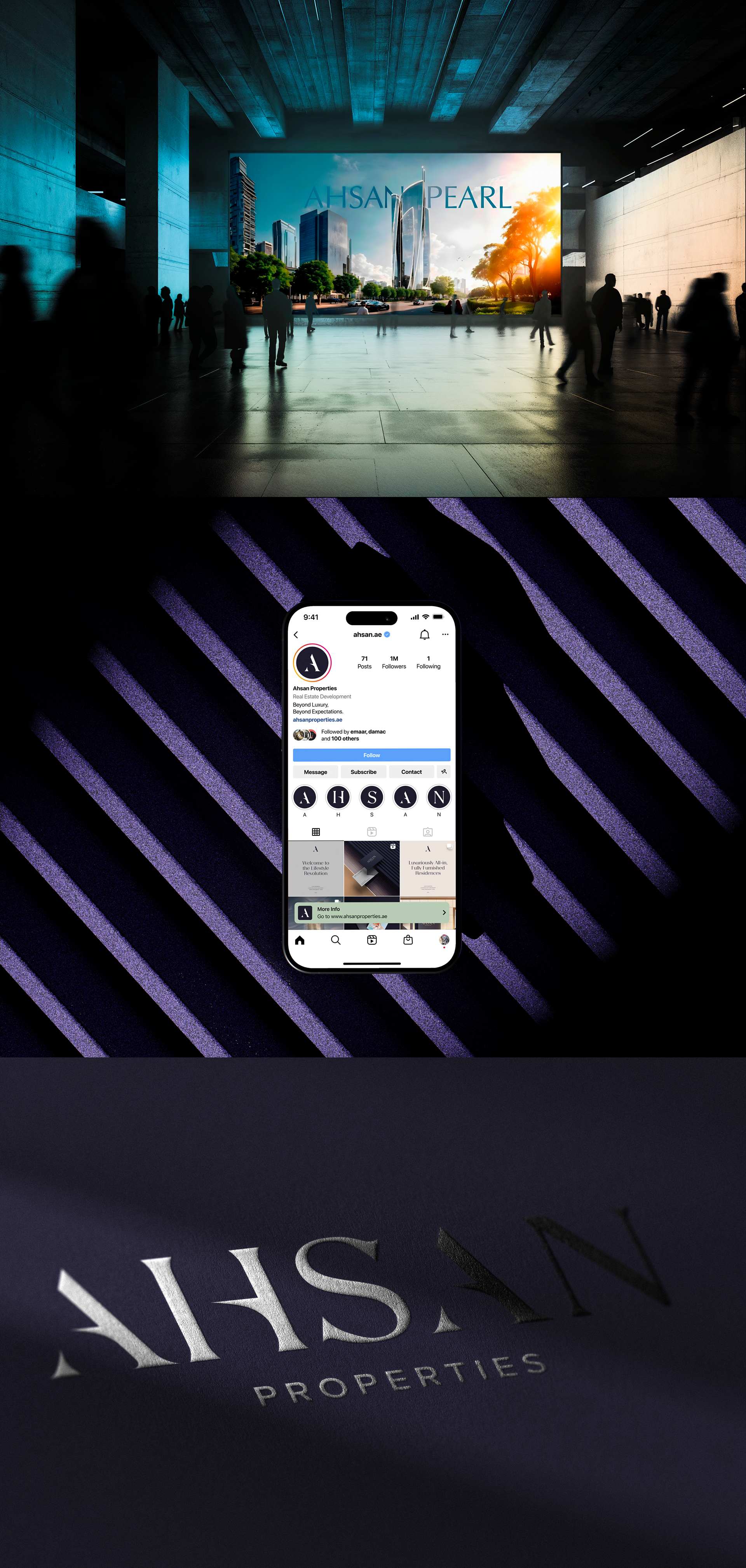
The logo represents the luxury real estate segment in the UAE. The silver font on a dark blue background symbolizes luxury, stability, and prestige. The word "AHSAN" comes from Arabic, meaning excellence and improvement, reflecting the company's philosophy of building high-quality and enduring projects. The minimalist and elegant style conveys reliability and exclusivity, appealing to affluent clients and investors.
You may also like
Unio Architects Brandbook and Visual Guidelines
2025
PrimeAsset — Campaign Logo Presentation
2025
MEATOPIA® — Фирменного стиля, нейминг бренда
2024
Brandbook - Gōsht Doner
2024
Brandbook | A complete guidelines of Rosso
2022
Logo Branding for EduPower LC
2022
BAO PRO Buildings | Visual identity
2022
Nafis® Inter Lux — Rebranding
2022
Rebranding, New Brand Identity — GŌSHT DONER (Concept)
2024
BROZONE — Brand Identity & Rebranding
2026